B2B • DRIVE-THROUGH • WINDOWS • MOULDINGS • COMMERCIAL EQUIPMENT
Easy•Serv
A service-led B2B brand identity system built for commercial drive-through environments. In particular, it supports drive-through windows, architectural mouldings, and commercial service equipment used in fast-food and high-volume service locations.
- B2B Branding
- Brand Identity System
- Logo Design
- Visual System
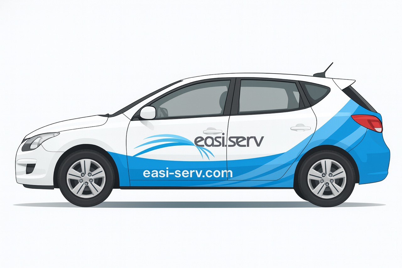
- Fleet Wrap Design
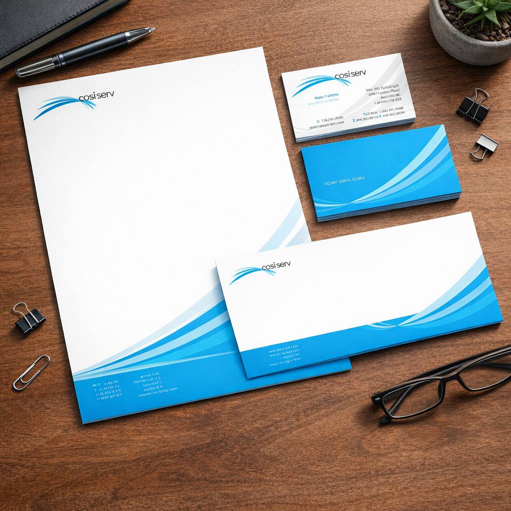
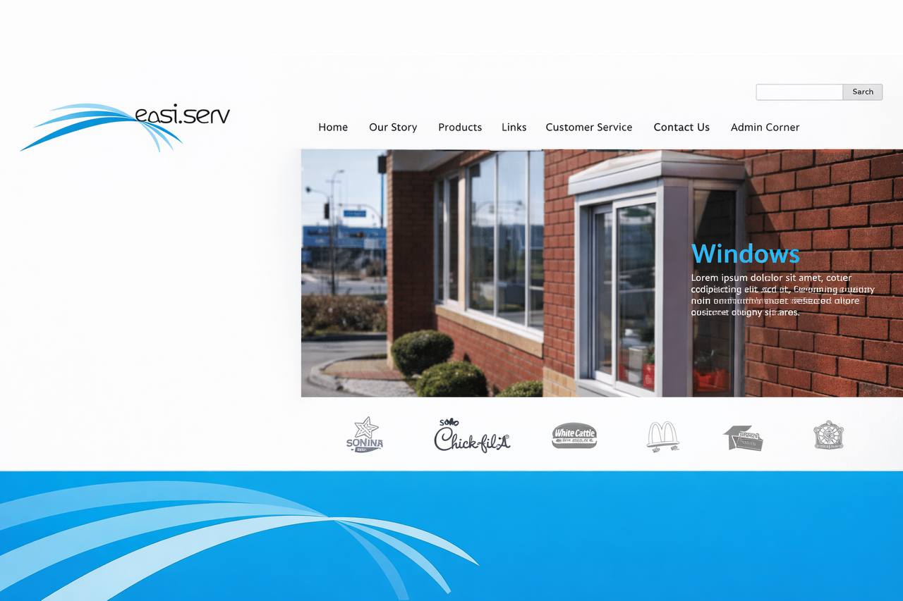
Identity applications
Business overview
Easy•Serv is a B2B provider for drive-through and commercial service environments. In other words, the company supports fast-food and high-volume service locations with window systems, mouldings, and in-store equipment.
As a result, the brand must perform in settings where speed matters. Moreover, products are used daily, so reliability is essential.
Therefore, the identity needed to be clear and easy to read. In addition, it had to feel dependable for operators and commercial buyers.
Finally, this work sits inside Collected Works as a strategy-led logo design and digital branding rollout.
Positioning
Easy•Serv operates in performance-driven environments. For this reason, the brand signals efficiency and technical reliability at a glance.
However, clarity alone was not enough. Instead, the identity also needed to feel service-led and approachable.
As a result, the positioning balances precision with simplicity. Furthermore, the system scales across equipment, signage, and vehicles without losing readability.
- Operational flow for drive-through environments
- Industrial B2B clarity for commercial buyers
- Service-led brand positioning built on trust
- Scalable brand identity system across touchpoints
Logo meaning
The logo uses a rounded, lowercase wordmark. As a result, the brand feels friendly and practical.
At the same time, the wave symbol adds motion and flow. Therefore, it reflects customer movement and service rhythm in drive-through settings.
Because the shape is simple, the mark stays clear at different sizes. Consequently, it works well on equipment, vehicles, and signage.
- Lowercase wordmark: friendly, functional
- Wave form: motion, continuity, service flow
- Simple geometry: readable and scalable
Colour palette (clean and trustworthy)
The palette is restrained and easy to apply. As a result, it supports clarity and consistency in commercial settings.
- Light blue: ease and smooth operation
- Mid/deep blue: trust and technical confidence
- White: cleanliness and simple layouts
- Neutral support: industrial and architectural context
Brand story: Easy•Serv is positioned as a dependable B2B partner. Therefore, the identity is built to keep service environments faster, cleaner, and more reliable through purpose-built components and equipment.
B2B • Drive-through • Commercial service systems
Scope of work
This project included end-to-end B2B branding. Specifically, we developed the strategy, logo, and a complete brand identity system. In addition, we extended the visual system into digital branding and fleet wrap design.
- B2B branding strategy and positioning
- Logo design and brand identity system
- Colour palette and visual system
- Digital branding direction (web-ready)
- Fleet wrap design system (vehicle graphics)
- Production-ready layout guidelines
- Consistency across applications
- Brand rollout alignment
Need a B2B identity system that stays clean across equipment, vehicles, and environments?
Get in Touch