
Realtor Branding for Agents Who Refuse to Be Average.
Absolute Creative builds premium Realtor brands that attract better buyers, stronger sellers, and high-value listings across Greater Vancouver and Vancouver Island.
Strategy-led branding systems for Realtors, teams, and real estate businesses.

Real Realtor Brands — Built as Clear, Consistent Systems.
A curated set of identity, photography, and marketing executions. Each project is structured to feel calm, premium, and instantly recognizable across every touchpoint.
From “attention” to “authority.”
This rebrand reframes the same professional strength through a modern lens: less noise, more clarity. We kept recognition, removed visual pressure, and rebuilt the brand around trust, premium restraint, and long-term confidence.

Built for attention in crowded advertising.
The visual language is bold, high-contrast, and promotional. It’s designed to win quick recognition in print-heavy channels and fast-glance environments.
Transaction-forward identity built around “sold” energy and high visibility.
Optimized for immediate response, short decision cycles, and quick memorability.
High-impact layout designed for bus benches, flyers, classifieds, and dense media.
- Strong “look-at-me” presence.
- Readable phone-first conversion.
- Visually time-stamped to its era.

Built for credibility that feels expensive.
The identity becomes calmer and more premium: clean space, controlled hierarchy, and a confident tone. It positions the realtor as a trusted advisor, not a pushy promoter.
Timeless mark + restrained layout that signals stability, maturity, and trust.
Designed to attract higher-intent clients who value clarity, process, and guidance.
Cleaner performance across modern channels: web, social, signage, and listing collateral.
- More premium with less visual pressure.
- More trust per second of attention.
- More flexible across platforms and formats.
Rebranding Point of View (Absolute Creative)
A rebrand is not decoration — it’s a strategic repositioning. We keep what the market already recognizes, then rebuild the system so it performs better: stronger trust cues, clearer messaging, cleaner hierarchy, and a visual tone that fits today’s premium expectations.
- Positioning shift: from “promotion” to “authority.”
- Message shift: from “sell energy” to “advisor confidence.”
- Design shift: from effects and compression to space and clarity.
- Performance shift: from print-first to omnichannel consistency.
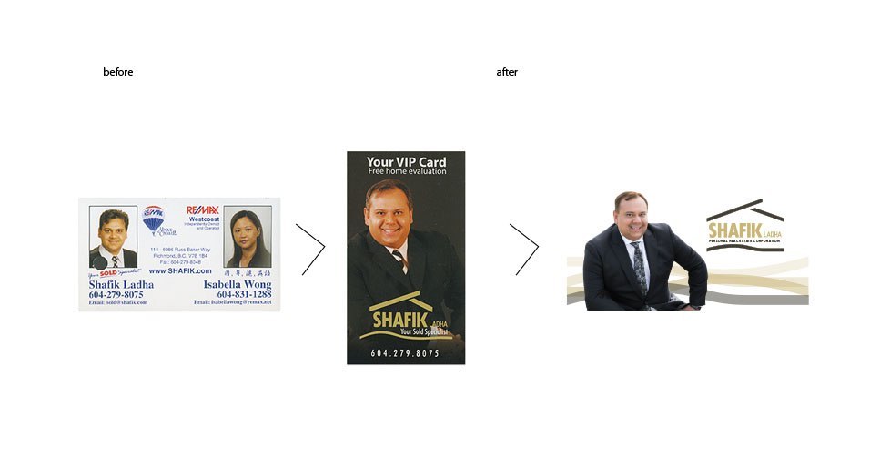
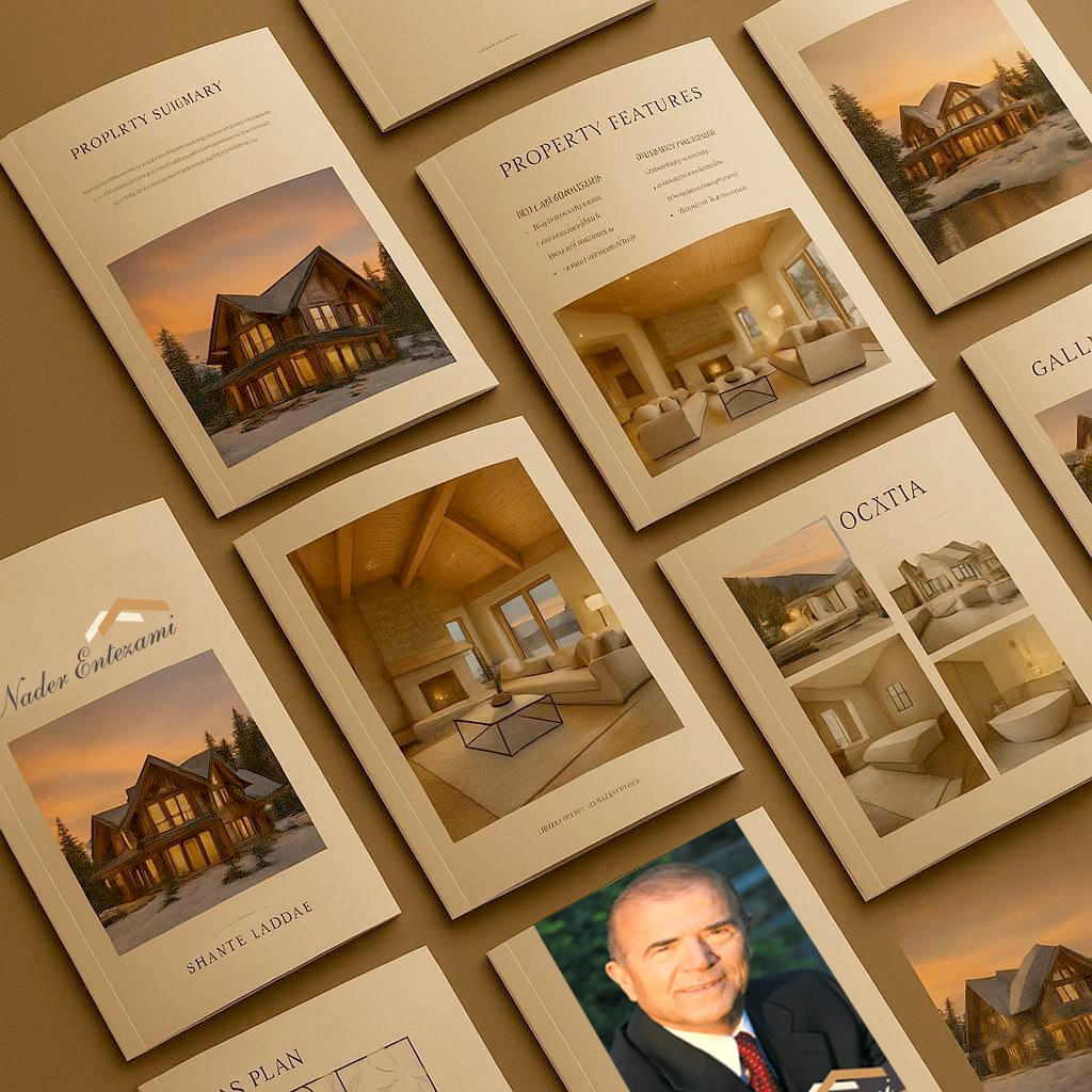
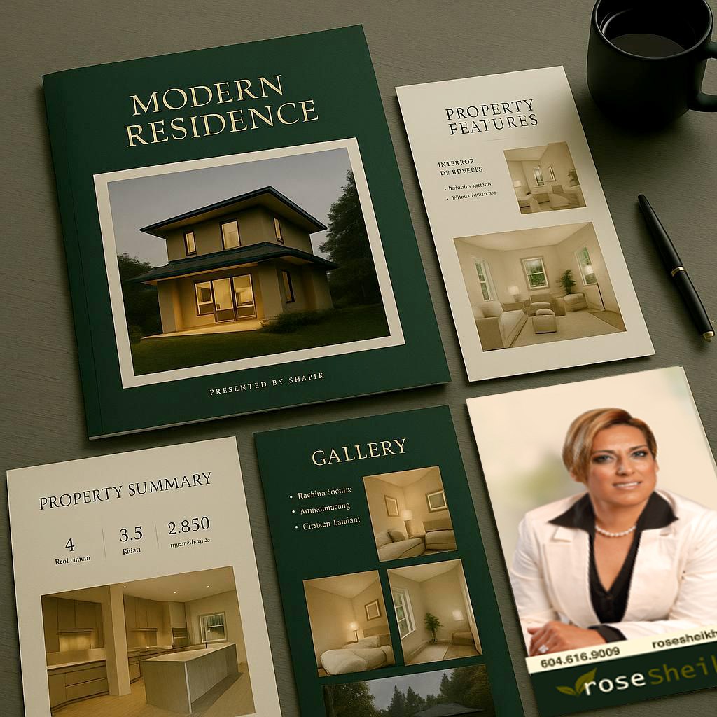
Shafik Ladha — Real Estate Identity System
A residential real estate identity engineered for confidence: stability in form, warmth in tone, and clarity in hierarchy — designed to read instantly across yard signs, listing decks, web, social, and advertising.
Branding Objective
Build instant category recognition and long-term credibility. In residential real estate, the identity must reduce decision anxiety: safe, established, and consistent at a glance — from signage distance to mobile screens.
Symbol / Mark
The roofline motif delivers immediate category decoding: home ownership, shelter, and protection. Clean geometry signals discipline, while the grounded base reinforces foundation, stability, and balanced guidance.
Colour Palette
A warm neutral / gold tone communicates value, maturity, and residential warmth. Single-colour discipline improves reproduction quality and consistency across print, digital, and environmental branding.
Typography
Bold sans-serif hierarchy increases clarity and memorability — critical for distance viewing (signage) and fast scanning (ads/social). Name-led structure strengthens personal brand recognition in referral markets.
Marketing Impact
Consistency is the conversion engine. A coherent system improves recall, reduces friction, and increases inquiry confidence through repeat exposure across campaigns and listing touchpoints.
Advertising Readability
Designed for one-second comprehension. A clear silhouette + strong name hierarchy improves performance in billboard-scale layouts, transit placements, listing ads, and social creative.
Psychological Message: “Trusted guidance. Stable decisions. Secure investments.”
Final Verdict: Category-correct, clear, confidence-building identity — intentionally familiar, professionally executed, and highly effective for residential market trust.
Before / After
Branding · Marketing · Advertising · Rebranding
Identity & Perception Shift
The redesign focuses on the commercial fundamentals of branding: clarity, consistency, and trust. A cleaner identity system improves perceived professionalism and creates a unified visual language across web, social, print, and advertising.
In real estate marketing, coherence is a performance advantage — it builds recognition, shortens decision time, and increases inquiry confidence through repeated exposure.
Trust • Experience • Stability • Professionalism
- Works best for: Higher-value properties
- Older / established clientele
- Trust-centric decision makers
Professional service and experience working for you.
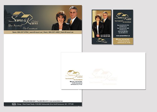
www.homesinvancouver.caRealtor Personal Brand — Roy Identity System
A modern personal realtor identity designed to balance human presence with professional credibility. The visual language communicates trust, clarity, and relational confidence — reinforcing a client-focused advisory posture within contemporary real estate markets.
Human-Centred Real-Estate Signifiers
The mark blends monogram/signature logic with subtle spatial cues — signalling both personal presence and property context. This duality reinforces identity, trust, and domain relevance.
Relational Authority vs Corporate Distance
The identity avoids generic corporate stiffness and decorative noise. Instead, it communicates a trusted advisor posture — emphasizing guidance, clarity, and client confidence.
Typography & Trusted Advisor Tone
Clean, modern typography feels elegant yet confident — professional without coldness. This supports communication clarity and decision reassurance.
Colour Discipline & Reassurance Psychology
A restrained palette reinforces calm confidence, credibility, and professional composure — ideal for relationship-driven real estate contexts.
Psychological Message: “Clear guidance — backed by trusted expertise.”
Final Verdict: Personal, professional, and category-aligned. The identity communicates trust, relational authority, and market credibility with minimal visual noise — a strong foundation for realtor personal branding.
Visual Positioning • Realtor Personal Brand
Trust-driven premium professional
This portrait reads as credible, calm, and approachable—a high-trust positioning that performs well in real estate where decisions are emotional and financial.

Visual Positioning
The image lands in a strong middle: competent but not intimidating. It signals authority without feeling cold, ideal for relationship-driven real estate sales.
- Professional authority: White blazer communicates credibility and professionalism.
- Approachability & warmth: relaxed pose and genuine smile build trust.
- Visual balance: expert but approachable—reduces buyer uncertainty.
Color Psychology
Safe, friendly, and modern color pairing reinforces trust and calm decision-making.
- White: trust, transparency, integrity.
- Turquoise / teal: calmness, stability, emotional reassurance.
Typography & Logo
Serif typography and gold tone reinforce premium yet stable positioning. Emphasis on name strengthens personal trust.
Strategic Brand Read
Best positioning: trust-driven premium professional. Not casual, not flashy—rooted in calm competence.
High-trust identityRealtor Personal Brand — Trust-Driven Identity System
A personal realtor identity designed to balance individual presence with market credibility. The visual language communicates professional trust, client advocacy, and real estate expertise — reinforcing confidence, clarity, and relational accessibility for reputation-driven property professionals.
Human-Centric & Professional Symbolism
The mark balances personal identity with real estate cues — suggesting signature presence, spatial reference, and property logic. This duality reinforces personal trust while maintaining industry credibility.
Personal vs Corporate Balance
The identity avoids generic corporate aesthetics and abstract forms disconnected from property context. Instead, it signals human presence, personal commitment, and relational credibility — critical in realtor psychology.
Typography & Accessible Authority
Clean, modern typography communicates confidence and clarity without rigidity. This strengthens decision-making trust and supports a posture that is both authoritative and approachable.
Colour & Credibility Psychology
A restrained palette supports calm confidence, professionalism, and market authority. The visual tone reassures rather than distracts — reinforcing long-term trust and client comfort.
Psychological Message: “Trusted expertise — guided by personal commitment.”
Final Verdict: Personal, professional, and category-aligned. The identity communicates trust, expertise, and client-focused authority with minimal visual noise — a strong foundation for personal realtor branding.
Relationship-Driven Trusted Advisor
This portrait prioritizes emotional safety over professional dominance. It reads warm, personal, and highly approachable — ideal for referral-driven, residential, and family-oriented client journeys.

Immediate Brand Impression
Warm, personal, highly approachable. The portrait communicates trust and emotional comfort rather than executive dominance.
Visual Positioning
A human-proximity portrait. Psychological distance is removed, creating familiarity instead of hierarchy.
Color Psychology
Black shifts from authority → comfortable confidence due to warm tones and relaxed facial expression.
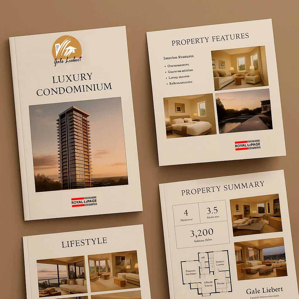
Realtor Personal Brand — Gale Identity System
A person-centric real estate identity designed to balance human presence with market credibility. The visual language communicates trust, expertise, and relational confidence — supporting client-first guidance and professional composure for modern property specialists.
Human-Centred Real-Estate Signals
The mark blends monogram/signature logic with subtle built-environment cues — echoing both the agent (person) and the property (place). This dual signal is psychologically powerful in real estate, where trust and location are inseparable.
Personal vs Corporate Balance
The identity avoids franchise-like rigidity and decorative lifestyle styling. Instead, it communicates relational presence with professional nuance — positioning the realtor as a trusted advisor, not a commodity service.
Typography & Approachable Authority
Clean, modern typography feels elegant yet confident — professional without coldness. This creates approachable authority: clear communication, market credibility, and personal accessibility for one-on-one client decision-making.
Colour Discipline & Calm Confidence
A restrained palette reinforces credibility, composure, and refined presence. In real estate, colour should reassure rather than distract — supporting trust, clarity, and long-term relationship confidence.
Psychological Message: “Calm expertise — personal guidance you can trust.”
Final Verdict: Personal, professional, and category-aligned. The identity communicates trust, market authority, and client-centered service with clarity and composure — a strong foundation for realtor personal branding.
Portrait Psychology • Realtor Personal Brand
Authority-driven experienced advisor
This portrait projects credibility, stability, and longevity more than warmth. It reads established, serious, and low-risk—optimized for premium clients, investors, and high-stakes decision environments.

Immediate Brand Impression
The image feels established, serious, stable, and experienced. It projects credibility and longevity over warmth and familiarity.
- Established • serious • stable • low-risk
- Less casual • less friendly-first • less lifestyle-oriented
- Credibility & longevity lead the perception
Visual Positioning
This is an authority-first framing: medium close-up, upright posture, neutral expression, and formal wardrobe establish status and expertise hierarchy.
- Psychological read: “Professional advisor.”
- Not: “Friendly trusted guide.”
- Authority and stability are primary signals
Expression & Emotional Tone
The slight smile is controlled and composed. Emotional expression is minimized—creating measured competence rather than relational warmth.
- Professional confidence • reserved personality
- Serious decision-maker energy
Color Psychology
Black suit reads as dominance and structure. The red tie is the key psychological lever— a decisiveness and negotiation-power signal. Warm sunlight adds realism without reducing authority.
- Black: authority • control • formal professionalism
- Red tie: strength • decisiveness • deal-maker energy
- Warm sunlight: authenticity, still authority-centric
Logo & Identity Treatment
Gold tone signals premium stability and long-term value. Serif/script styling reads as legacy / established— aligned with the portrait personality and high-credibility market positioning.
- Premium stability • property association • long-term value
- Legacy cues support an experienced advisor archetype
Strategic Brand Positioning
This portrait lands clearly as an Authority-Driven Experienced Advisor. Strong for premium segments and high-stakes negotiation contexts, with a trade-off of slightly reduced emotional accessibility.
High-credibility / expertise-firstTrade-off: more “he knows the market” than “he feels like a friend”—a deliberate positioning choice.
Final verdict: strong authority and credibility identity; sells experience, stability, decisiveness, and professional control.
Portrait Psychology • Realtor Personal Brand
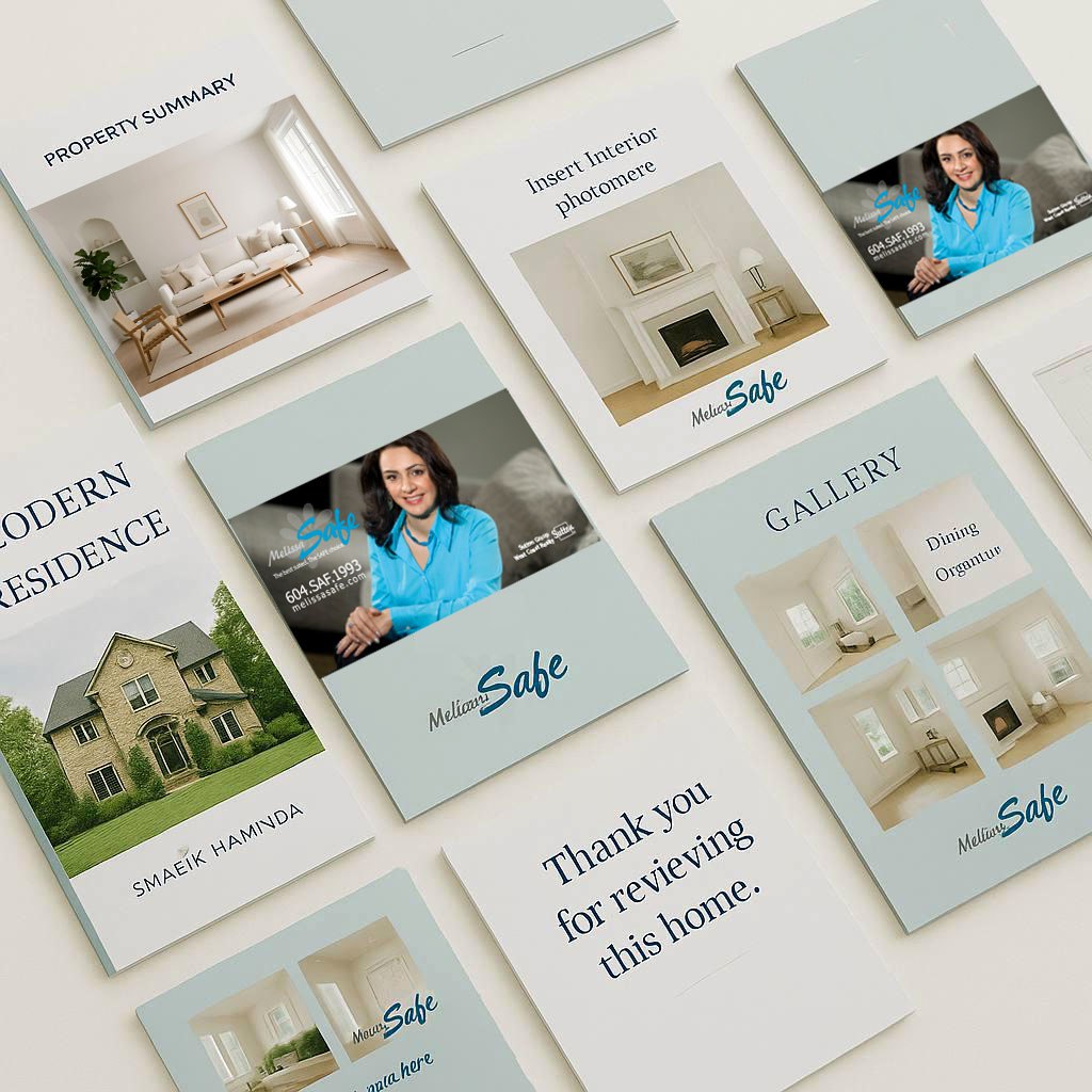
Trust-driven relationship realtor
This portrait prioritizes emotional safety and client comfort. It reads warm, reassuring, and low-pressure—positioning Melissa as the “safe choice” for residential decision journeys.
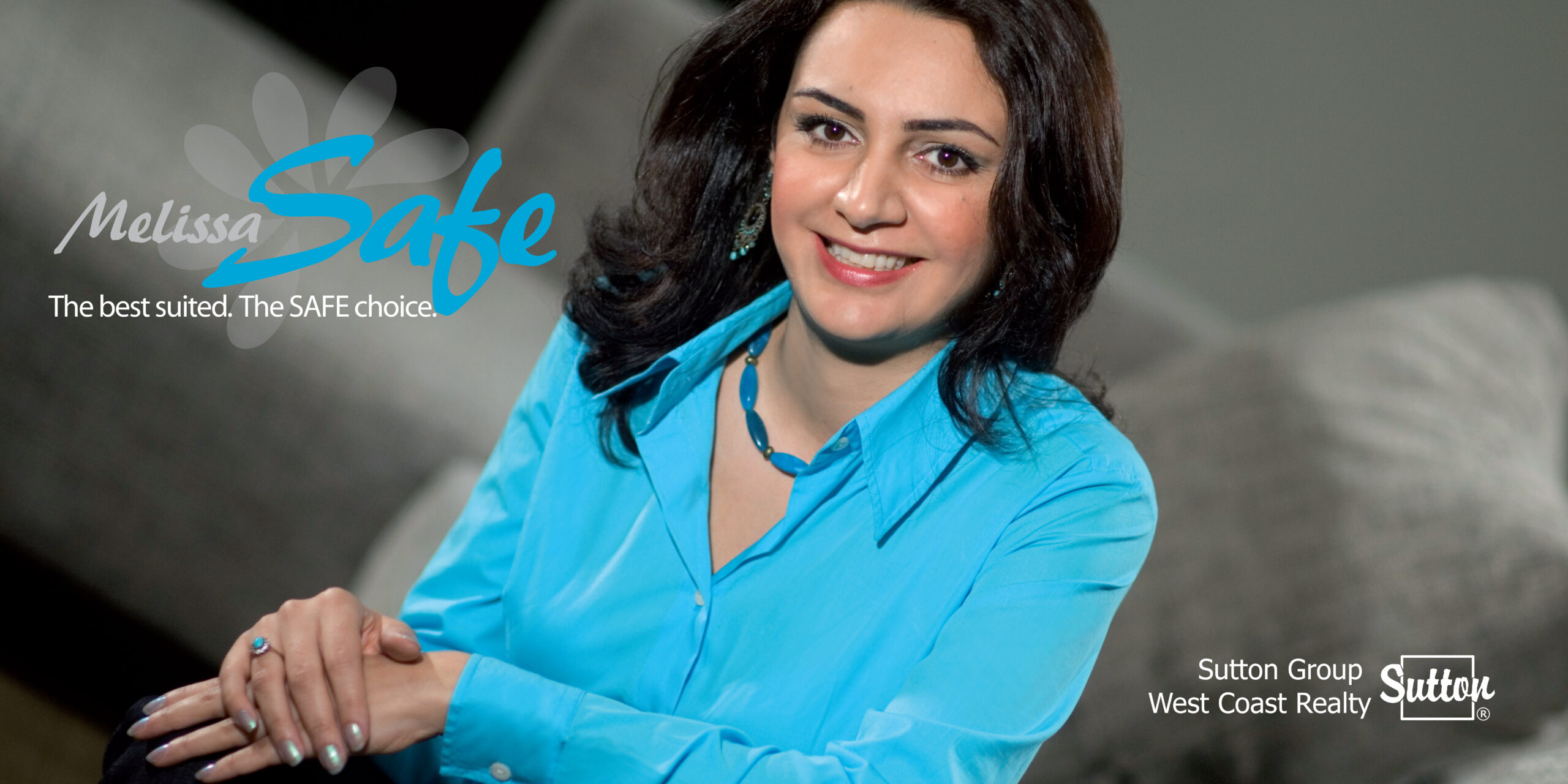

Immediate Brand Impression
The image feels warm, reassuring, and emotionally safe. It projects comfort and trust more than status or dominance—ideal for clients who want a calm guide.
- Warm
- Reassuring
- Approachable
- Friendly-first
- Low-pressure
Visual Positioning
This is a relationship-first portrait: relaxed posture, soft body language, and an open smile. The positioning is “trusted guide,” not “dominant closer.”
- Framing: reclined / relaxed posture, hands folded gently, no rigid structure.
- Read: “trusted guide / supportive advisor.”
- Net effect: almost zero intimidation energy.
Expression & Emotional Tone
A genuine smile and relaxed facial expression create high likability and emotional accessibility. This feels conversational and client-comfort driven.
- Genuine smile (strong trust cue)
- Relaxed facial muscles
- Soft eye engagement
- Low-pressure presence
Color Psychology
Teal is doing heavy lifting: it signals calmness, stability, trust, and reassurance—friendly professionalism, not dominance. The neutral background keeps the emotional tone smooth and safe.
- Teal: calmness, emotional balance, stability, trust, reassurance, soft confidence.
- Grey/neutrals: softness, low aggression, focus on face and smile.
Typography & Messaging
A script-style name reads personal and human. The “SAFE choice” line is psychologically powerful—risk reduction and decision comfort.
- Script name: warmth, personality, approachability.
- SAFE choice: trust framing, anxiety relief, high conversion cue.
Strategic Brand Positioning
This portrait lands as a trust-driven relationship realtor—reassuring, emotionally intelligent, and comfortable. Strong for residential and referral-heavy markets, even if it reduces the “authority-first” signal.
High-trust / high-comfortTrade-off: more “she will take care of me” than “she will aggressively control negotiations.” Positioning choice, not a flaw.
Portrait Psychology • Realtor Personal Brand
Modern, approachable advisor
This portrait is optimized for connection and personal trust. It reads friendly, confident, and easy to talk to—positioning the realtor as a relationship-first guide with credible professionalism.


Immediate Brand Impression
This image feels confident, approachable, and modern. It emphasizes personal comfort and relationship energy more than formal authority.
- Confident • friendly • client-ready
- Less intimidating • less legacy/formal
- Connection leads the perception
Visual Positioning
This is connection-first framing: close crop, forward-leaning posture, and direct eye contact create immediacy and familiarity.
- Psychological read: “Friendly advisor who gets it.”
- Not: “Untouchable executive authority.”
- Trust and ease-of-conversation are primary signals
Expression & Emotional Tone
The smile is the strongest trust lever here—open, relaxed, and welcoming. It creates high likability and reduces client anxiety.
- Genuine smile • relaxed face • low-pressure energy
- Reads as helpful, positive, easy to work with
Color & Style Psychology
The black-and-white treatment adds timeless seriousness without making the portrait cold. Suit + open collar signals modern professionalism—structured, but human.
- B/W: timeless • clean • brand-focused
- Suit + open collar: credible • modern • approachable
- Overall: classic clarity + relational warmth
Brand Hierarchy & Usage
- Face-first hierarchy supports personal trust
- Clean background keeps attention on expression
Strategic Brand Positioning
This portrait lands as a Modern Relationship-First Realtor— strong for residential, referral-driven markets where comfort converts.
High-likability / trust-forwardTrade-off: slightly less “legacy authority” than traditional luxury portraits—balanced by higher approachability and conversation-readiness.
Final verdict: strong modern personal brand image; sells trust, accessibility, and confident professionalism.
Portrait Psychology • Realtor Personal Brand
Premium, competence-first advisor
This portrait blends executive clarity with approachability. White/black contrast reads clean and professional, while the expression stays composed—positioning Rose as a credible, premium, client-ready advisor.

Immediate Brand Impression
The image feels polished, confident, premium-leaning, and composed. It communicates professional authority without aggression—more “in control” than “intimidating.”
- Professional credibility with controlled warmth
- Less casual • less playful • less lifestyle-first
- Reads: “serious professional — you’ll be taken care of.”
Visual Positioning
This portrait uses a competence-first framing. The forward posture, clean composition, and direct gaze suggest accountability and confidence—positioning Rose as a decision-ready advisor.
- Psychological read: “Confident advisor.”
- Clear professional structure without harsh dominance cues
- Personal enough to feel direct, formal enough to feel premium
Expression & Emotional Tone
The expression is measured and composed. This communicates calm control and reliability, rather than heavy friendliness or overt dominance.
- Controlled warmth • low drama • client-ready composure
- Trust through steadiness, not performative emotion
Color Psychology
White blazer signals clarity, transparency, and premium service. Black adds structure and authority. The contrast feels “executive clean”—powerful without intimidation. Pearls reinforce classic elegance and established premium cues.
- White: trust • clarity • premium cleanliness
- Black: authority • structure • professionalism
- Pearls: classic elegance • refined credibility
Brand Identity Signals
The overall system supports a premium, reachable, legitimate positioning—ideal for higher-value residential clients who want polish, control, and calm clarity.
- Conversion-ready presentation (clear, direct, professional)
- Premium cues without flashy status signaling
- Advisor-first brand personality
Strategic Brand Positioning
This portrait lands as a Premium, competence-first advisor—strong expertise perception with controlled warmth. Best for move-up buyers, professional households, and higher-value residential transactions.
Premium / trust / clarityTrade-off: stronger competence perception, slightly less “friend-first” softness.
Final verdict: premium clarity + calm authority—professional, credible, and client-ready.
Portrait Psychology • Realtor Team Brand
Authority-driven partner team
This portrait reads as a stable, established real estate partnership. It signals professionalism, tradition, and low-risk dependability—positioning the team as experienced advisors rather than lifestyle-focused, friendly-first personalities.

Immediate Brand Impression
This image feels established, traditional, stable, and credibility-heavy. The team format projects reliability and continuity—more “professional system” than “single personality brand.”
- Established • formal • dependable • low-risk
- Less casual • less lifestyle-oriented • less modern/trendy
- First read: “experienced professional team”
Visual Positioning
The composition is dual-authority by design. Two subjects signal scale, legitimacy, and continuity— creating a “there is a system behind this brand” impression.
- Team effect: reinforces trust through perceived stability and coverage
- Body language: upright posture and controlled expression reduce uncertainty
- Read: professional credibility over emotional warmth
Expression & Emotional Tone
Smiles are polite and measured—friendly enough to be approachable, but controlled enough to maintain status. The tone is measured professionalism, not expressive lifestyle branding.
- Professional confidence • respectable presence • low drama
- More “serious advisors” than “conversational friends”
Color Psychology
The black wardrobe dominance establishes authority and structure. The gold accents (tie + identity mark) add premium value, legacy cues, and long-term stability—classic luxury/service psychology.
- Black: authority • structure • formal professionalism
- Gold: premium value • stability • legacy / longevity
- Warm background: softens without reducing authority
Logo & Identity Treatment
Serif/script identity cues read as legacy and established reputation. Combined with gold, it signals long-term value and trust—high alignment with the portrait’s authority tone.
- Legacy cues • premium stability • reputation-first messaging
- Team + identity system strengthens continuity and perceived scale
Strategic Brand Positioning
This lands as an Authority-Driven Realtor Team: stable, professional, and low-risk. Ideal when you want credibility to lead the conversation—especially in higher-value or conservative client psychology segments.
High-credibility / reputation-firstTrade-off: more “serious professionals you can trust” than “modern lifestyle-friendly energy.”
Final verdict: high-credibility team authority portrait with premium stability cues and strong system reinforcement through marketing applications.
Portrait Psychology • Realtor Offer-Led Brand
Market disruptor — price-first conversion strategy
This brand is engineered as a high-performance deal proposition—offer-led, value-driven, and sales-optimized. The creative uses strong hierarchy and risk-reversal signals to make a disruptive price feel credible and safe.

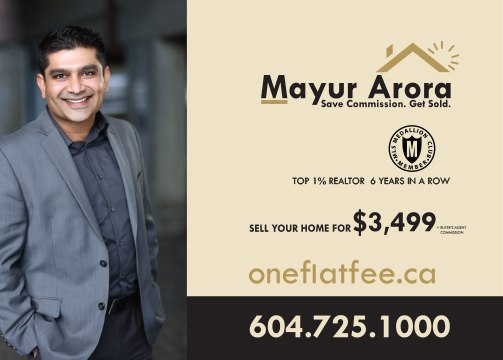
Immediate Brand Impression
The image feels commercially aggressive, value-driven, highly strategic, and sales-optimized. It projects performance and measurable advantage over warmth and legacy prestige.
- Commercially aggressive • results-oriented • confident
- Less soft/emotional • less relationship-first • less prestige tone
- Primary read: “High-performance deal proposition.”
Core Brand Strategy
This is a price disruption narrative. The offer becomes the brand—designed to cut through noise instantly. The price is intentionally dominant: it is the fastest comparator in a crowded market.
- Everything revolves around a single, concrete number
- Face and identity support the offer (not the other way around)
- Deliberate clarity: low cognitive load, high action probability
Visual Hierarchy
The creative follows direct-response sequencing with near-zero waste: face → name → credibility → price → phone. This builds attention, trust, conversion trigger, then action path.
- 1️⃣ Face: attention anchor
- 2️⃣ Name: identity validation
- 3️⃣ Credentials: risk reduction
- 4️⃣ Price: conversion trigger
- 5️⃣ Phone: action path
Portrait Psychology
The portrait signals approachable + confident + energetic. This is crucial because aggressive pricing without warmth can create distrust—so the smile and openness neutralize sales intensity.
- Open smile + eye contact reduces perceived “hard sell” risk
- Modern styling keeps it contemporary and competitive
- Signal balance: “strong offer” + “safe to work with”
Color Psychology
Grey and dark tones communicate stable modern professionalism without heavy dominance. This avoids “luxury authority” while remaining credible for transactional decisions.
- Grey: neutral intelligence • professionalism • stability
- Dark shirt: confidence • contemporary edge
- Avoids: heavy authority / soft lifestyle extremes
Typography & Messaging Psychology
The language is designed for immediate comparison and anxiety reduction: strong benefit framing, credibility proof, and a single dominant conversion trigger.
- Benefit line: commission savings + outcome certainty
- Risk reversal: performance credential neutralizes “cheap = low quality”
- Price: concrete, disruptive, easy-to-compare
Strategic Brand Positioning
This brand lands as a Market Disruptor—an offer-led, high-volume acquisition system. It trades prestige perception for speed, clarity, and lead generation performance.
Offer-led / direct-response realtor brandTrade-off: less prestige/exclusivity tone—more “smart operator” than “legacy luxury authority.”
Final verdict: exceptionally strong conversion-engineered realtor brand; sells savings, performance, and action clarity.
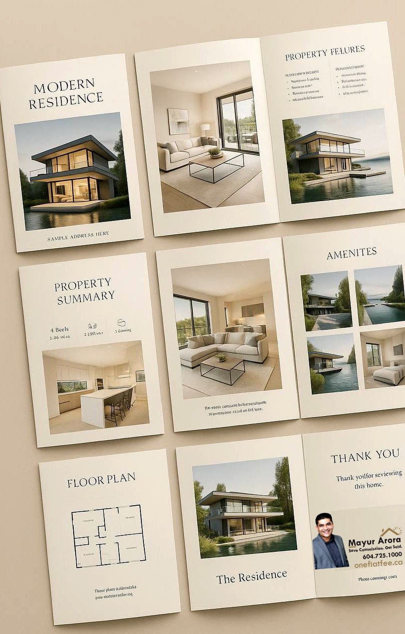
One Flat Fee — Realtor Pricing Model Identity
A value-driven real estate identity built around fee transparency, commission disruption, and consumer confidence. The brand communicates financial clarity and predictable outcomes — positioning itself as a rational alternative to traditional commission-based models.
Naming as Value Proposition
The name itself communicates the business model directly — predictability, simplicity, and financial control. In real estate, where commission anxiety is significant, this creates immediate psychological reassurance.
Category Anchoring Symbolism
The minimal roofline graphic establishes instant property recognition without resorting to cliché illustrations. The structure feels familiar, stable, and aligned with real estate expectations.
Positive Gain Psychology
The radiating spark cue subtly introduces optimism and financial upside. In the context of fee savings, this signals benefit and opportunity rather than aggressive promotional energy.
Colour & Financial Logic
Gold tones reinforce value, retained capital, and economic advantage, while the dark base provides professional grounding and stability. Together, the palette supports credibility and rational decision-making.
Psychological Message: “Predictable fees. Clear outcomes. Smarter property decisions.”
Final Verdict: Category-perfect and conversion-aligned. The identity communicates value, trust, and financial logic with strong clarity — a highly effective positioning strategy for fee-model real estate services.