
Identity System & Holistic Total System (HTS)
A calm, heritage-inspired dairy world: exterior, interior, logo, palette and product language working as one quiet, confident system.

From anonymous farmer to quiet, iconic dairy brand
The client was a small family dairy producer: excellent product, no name, no brand, no system. Milk, yogurt, butter and cheese were sold as “just dairy” in a noisy, discount-driven market.
The challenge
- Move from generic “farmer’s dairy” to a memorable, ownable brand.
- Build trust around organic, grass-fed and sanitary production.
- Create a retail experience that feels calm and premium, not loud and promotional.
- Design a system that can scale from one shop to a full franchise network.
The opportunity
Research confirmed a growing appetite for honest, organic everyday dairy. If we could give the product a clear name, a disciplined identity and a quiet, confident retail language, MR. NATURAL could own the “organic for life” position in the category.
MR. NATURAL becomes the calm, dependable organic choice in a crowded, price-driven shelf.
Strategy & naming — Organic for life
Through a brand workshop we moved the conversation from “how do we sell more milk?” to “what kind of life are we inviting people into?”. The answer became the brand promise: Organic For Life – simple, honest dairy that respects land, animals and people.
Brand platform in one line
MR. NATURAL is the neighbour who quietly does things the right way – no shortcuts, no shouting, just real dairy you can drink every day.
What the name unlocks
- A human figure at the centre of the crest — someone you feel you know.
- Space for a full family: milk, yogurt, butter, cheese and future ranges.
- A tone of voice that is warm, calm and slightly old-world without feeling dated.
The crest: human warmth sitting over stylised fields — a quiet promise of origin and care.
Identity system — one language, many products
The Holistic Total System (HTS) keeps every detail connected: logo, typography, palette, packaging structure, interior architecture and small objects on the counter all speak the same visual language.

Honest dairy presented like a quiet café. Deep green joinery and warm brass against calm cream walls.

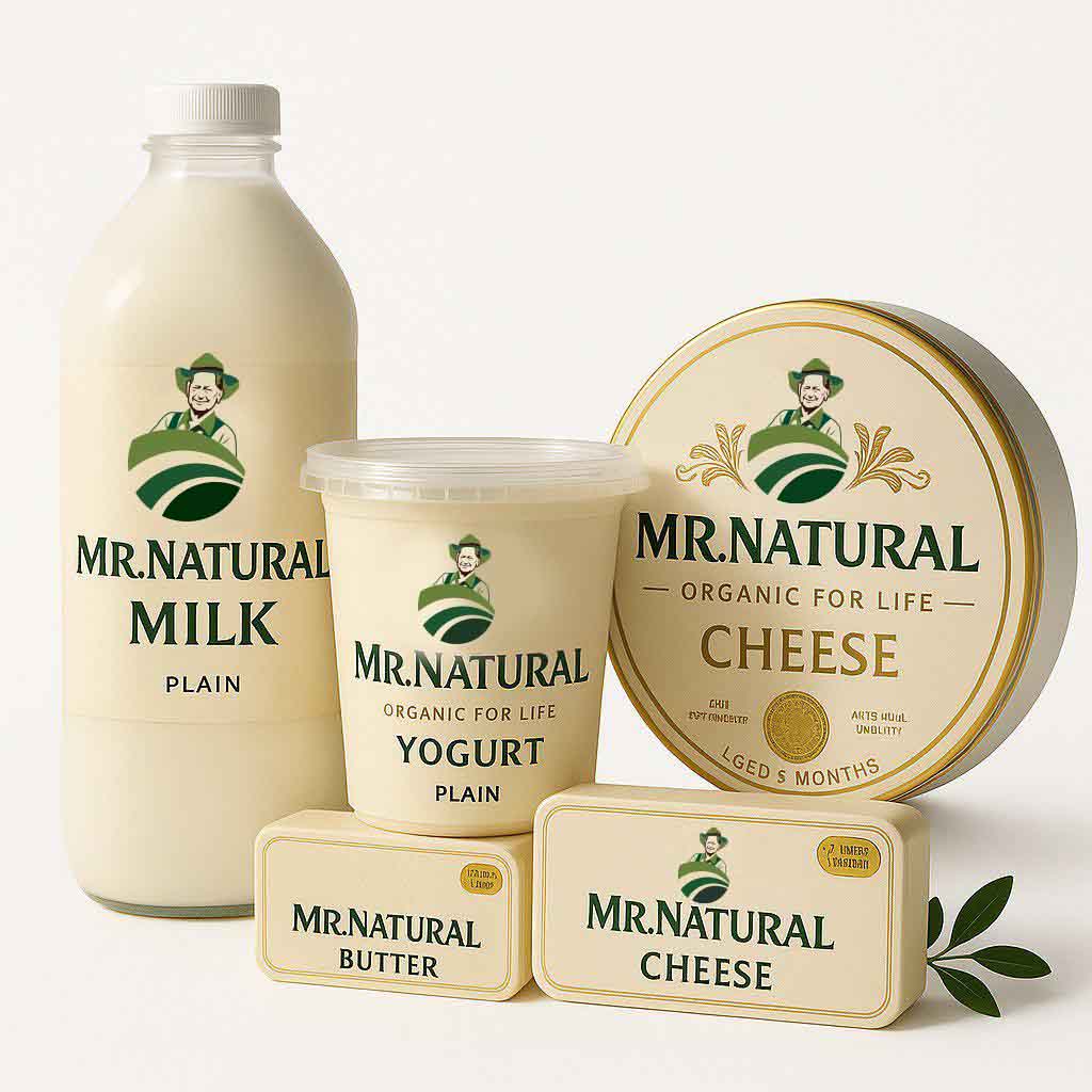
Milk, yogurt, butter and cheese share one grid, one typographic rhythm and one calm front-of-pack story.

Deep heritage greens, soft creams and gentle gold accents — no neon, no clutter, no shouting.
Everyday products, treated like little rituals
The packaging is minimal on purpose. Instead of shouting benefits, each pack feels like it belongs on a calm kitchen counter — something you are happy to see every morning.
Pack behaviour
- Hierarchy led by product name and MR. NATURAL crest, not claims.
- Typography large enough to read from across the aisle, without aggression.
- Space left for future flavours and seasonal editions without breaking the system.
Storytelling on the table
When all products sit together – milk, yogurt, butter, cheese – they tell one story: someone has thought about every detail, so the customer doesn’t have to.

Storytelling rooted in land, people and daily life — not manufactured lifestyle clichés.
Results & HTS — built to scale quietly
The MR. NATURAL system is designed to travel: from the first flagship shop to future neighbourhood locations, from local retailers to national shelves, without losing its calm centre.
For Absolute Creative, MR. NATURAL is a reminder that the most powerful brands don’t always look loud. Sometimes the bravest move in a chaotic category is to go quiet, precise and human.