Alton Brand Identity System
Engineered precision expressed through a disciplined corporate identity—built to perform across product, retail, and communication.
The Alton system was designed as a working tool: it protects brand consistency, accelerates marketing production, and makes advertising execution cleaner—so every touchpoint signals confidence, quality, and control.
Calm authority, built for scale
Alton needed a brand that stayed corporate and premium without becoming decorative. The system prioritizes clarity, repeatability, and long-term consistency—so internal teams can execute fast while maintaining a unified brand signal.
Branding that reduces friction in marketing and advertising
What the identity system ships
- Core mark and usage rules (primary, secondary, mono applications)
- Typography hierarchy for corporate communication
- Color and contrast rules for reliable reproduction
- Layout logic for product sheets, retail signage, and marketing collateral
- Asset kit for marketing teams (templates, lockups, spacing rules)
- Advertising-ready components (headlines, grid system, brand-safe compositions)
A restrained system that holds up in the real world


What separates a top agency from a design vendor
- System thinking: can the identity scale across teams, vendors, and channels?
- Consistency rules: do you get a usable framework, not just pretty mockups?
- Marketing readiness: can internal teams produce assets without constant creative approval?
- Advertising alignment: does the system support campaign repetition without visual drift?
- Implementation clarity: templates, files, standards, and decision rules are included.
Continue through the system
These links build topical authority and help visitors move from proof to purchase
Questions buyers ask before hiring an agency
Is this just a logo redesign?
No. The outcome is an identity system: rules, structure, templates, and scalable components that support marketing production and advertising consistency.
How does this improve marketing performance?
A system reduces rework, speeds up production, protects brand consistency, and makes messaging and visuals easier to repeat—so campaigns stay coherent across channels.
Do we own the files and templates?
Yes. A proper identity system includes usable assets for internal teams and external vendors—built for implementation, not just presentation.
Can you support rollout across product and retail?
Yes. We design identity systems with real-world constraints in mind—production, vendors, retail applications, and long-term maintenance.
Build a corporate brand system that stays consistent under pressure
Рейтинги продавцов помогают выбрать надежного партнера. Изучайте kraken market система рейтингов с отзывами реальных покупателей.
Alton Brand Identity System
Corporate identity, brand character, and colour standards for the Alton brand.
Core Brand Colours
Corporate Blue
Pantone: 282 C
Meaning: Trust, authority, professional confidence.
Heritage Gold
Pantone: 126 C
Meaning: Stability, heritage, quality, reliability.
Signal Yellow
Pantone: 116 C
Meaning: Illumination, awareness, optimism.
Brand Personality & Values
Corporate Blue — 282 C
Credible, authoritative, strong, reliable, loyal, confident, professional, quality-driven and timeless.
Heritage Gold — 126 C
Grounded, reassuring, established, premium, trustworthy and dependable.
Signal Yellow — 116 C
Illuminating, enlightening, optimistic, aware, bright and informative.
Brand Character Metaphor — The Sunflower
ALTON is symbolized by the sunflower — a living expression of warmth, energy, optimism, and quiet strength. The sunflower always turns toward the sun, seeking light with purpose and intention. This natural instinct reflects the heart of ALTON: aware, positive, and always facing forward.
Just as the sunflower draws life from sunlight, ALTON creates warmth and light inside the home — at the center of family life — in the kitchen. The flame on the stove is like a living heartbeat. It flickers and moves gently, never rigid, never mechanical — alive, human, and full of quiet energy.
“The stove flame is the sunrise of the home — the beginning of every day.”
Around this flame, families gather. Meals are created. Stories are shared. Life continues. The sunflower becomes the symbol of this relationship between warmth, energy, purpose, and life in motion.
The Character of ALTON
ALTON reflects the qualities of the sunflower:
- alive — not mechanical
- warm — not cold
- human — not industrial in tone
- optimistic — always facing forward
- reliable — always turning toward the light
These qualities define the emotional core of the brand and inform the visual, verbal, and experiential expression of ALTON worldwide.
The sunflower is repeated throughout nature with quiet perfection. ALTON reflects the same disciplined consistency in engineering, materials, finishing, and performance.
Wherever the sunflower stands, there is always light.
Wherever ALTON lives, there is always life in the kitchen.
Meaning in the Brand System
This metaphor is not decoration — it is strategic DNA. It guides:
- color expression
- tone of communication
- photographic atmosphere
- storytelling
- brand recognition
The sunflower gives ALTON a unique emotional identity: warm, positive, trustworthy, and quietly confident.
Alton — The Sunflower Brand Character
A credible, strong, reliable identity that blends engineering with human warmth — creating a timeless visual symbol for everyday life.

A Sunflower — Calm, Professional, Human
The symbol expresses credibility, warmth, strength and emotional intelligence — without shouting.
At the centre of a clean, minimal field stands a sunflower — credible, authoritative, strong and reliable. It feels joyful and friendly while remaining professional, confident and timeless.
The geometric spiral expresses innovation and precision, while the petals radiate warmth, optimism, loyalty and human connection. This is a brand that feels both engineered and alive.
Core Character
Warmth & Life
Human-centred, friendly, sociable. A brand that becomes part of everyday living.
Energy
Emotional warmth — optimistic, lively, illuminating.
Renewal
Forward-moving, resilient, timeless.
Precision & Intelligence
Innovative, credible, authoritative and professional.
Identity with Confidence
Subtle branding — presence without noise.
Emotional Promise
Strategic Positioning
ALTON — Logo Identity System
The ALTON logo is constructed through disciplined geometry, architectural alignment, and engineered proportions. It communicates a corporate brand defined by precision, strength, trust, professionalism, and long-term quality.
The golden accent above the “N” represents a moment of warmth and intelligence — a spark, a sunrise, a flame. It signals innovation, performance, and optimism while the deep, confident typography anchors the brand in reliability and engineering discipline.
Together, they create a balance of logic and emotion — a premium identity that feels structured, reassuring, and life-enhancing.
Logo Meaning & Brand Role
Brand Character
ALTON stands for engineered quality with human warmth. The logo expresses confidence, clarity, and trust — reflecting a corporate brand built on performance and integrity.
It feels credible, authoritative, strong, reliable, optimistic, and timeless.
Precision by Design
The grid system and proportional spacing communicate discipline. Every line and curve has purpose. This reflects manufacturing intelligence, quality control, and repeatable excellence across every product.
Logo Usage Principles
Clear Space
A minimum clear space equal to the defined “X” unit must surround the logo on all sides. This protects clarity, legibility, and presence.
Minimum Size
Print minimum width: 25 mm
Digital minimum width: 140 px
Below this size, simplified formats are recommended.
Color Rules
The preferred version uses a deep primary wordmark with a warm gold accent on neutral, uncluttered backgrounds.
Avoid distortion, effects, loud colors, or visual noise.
Identity Protection
The golden accent is a protected recognition asset. It must never be altered, rotated, detached, or stylized.
Symbolism
The ALTON symbol language represents engineered confidence supported by human warmth. It embodies precision manufacturing, professional discipline, and premium brand clarity — while celebrating the simple human truth that great products support everyday life, family, and meaningful daily rituals.
ALTON Brand Identity System
Engineered precision expressed through a disciplined, corporate identity system with calm confidence. Intelligent quality, designed for life at home.

ALTON — Brand Manifesto
We believe that the heart of every home, every workspace, and every moment of daily life deserves more than just function — it deserves trust.
ALTON exists to bring intelligence, reliability, and quiet confidence into everyday living. Our products are engineered with discipline, designed with intention, and made to serve with warmth and humanity. The sunflower — our symbol — reminds us that performance is not only about power and strength. It is also about life, light, and optimism.
Where others chase complexity, we create clarity.
Where others deliver products, we build long-term relationships.
Where others fade into trends, we stay grounded in timeless principles.
We stand for work done properly.
For materials chosen with care.
For engineering that is honest, rigorous, and dependable.
Our commitment is simple:
- Quality without compromise
- Performance without noise
- Design without ego
- Warmth without weakness
We believe the brands people trust most are the ones that remain consistent — in behavior, in delivery, and in values.
ALTON is built on that promise.
A steady presence.
A dependable partner.
A brand that stands behind every product — quietly, confidently, always.
Because reliability isn’t loud. It’s proven — every single day.
Brand Identity Guidelines — Structural Overview
1. Brand Essence
Core Idea: Intelligent quality — delivered with human warmth.
Values
- Reliability
- Integrity
- Clarity
- Intelligence
- Service
- Timeless design
Brand Personality
- Confident
- Calm
- Helpful
- Strong
- Credible
- Optimistic
2. Logo Usage
Primary Logo
ALTON wordmark with gold underline bar. Use on navy or white backgrounds only.
Symbol
Sunflower emblem used for storytelling, sealing, packaging and premium experiences.
Clear Space
Minimum clear space is the height of the capital “A” on all sides.
Do Not
- distort the logo
- rotate or tilt
- fade or reduce contrast excessively
- place on busy imagery
- change the underline color
- add shadows, outlines or special effects
The logo is never decorative. It is a signature.
3. Color System
- Navy — Authority / Trust
- Sunflower Yellow — Warmth / Energy
- White — Clarity / Honesty
Dark base = strength.
Yellow accent = illumination.
White = space to breathe.
Avoid clutter. Avoid loudness. Avoid trend colors.
4. Typography
Clean, structured, human. Always prioritize readability and spacing.
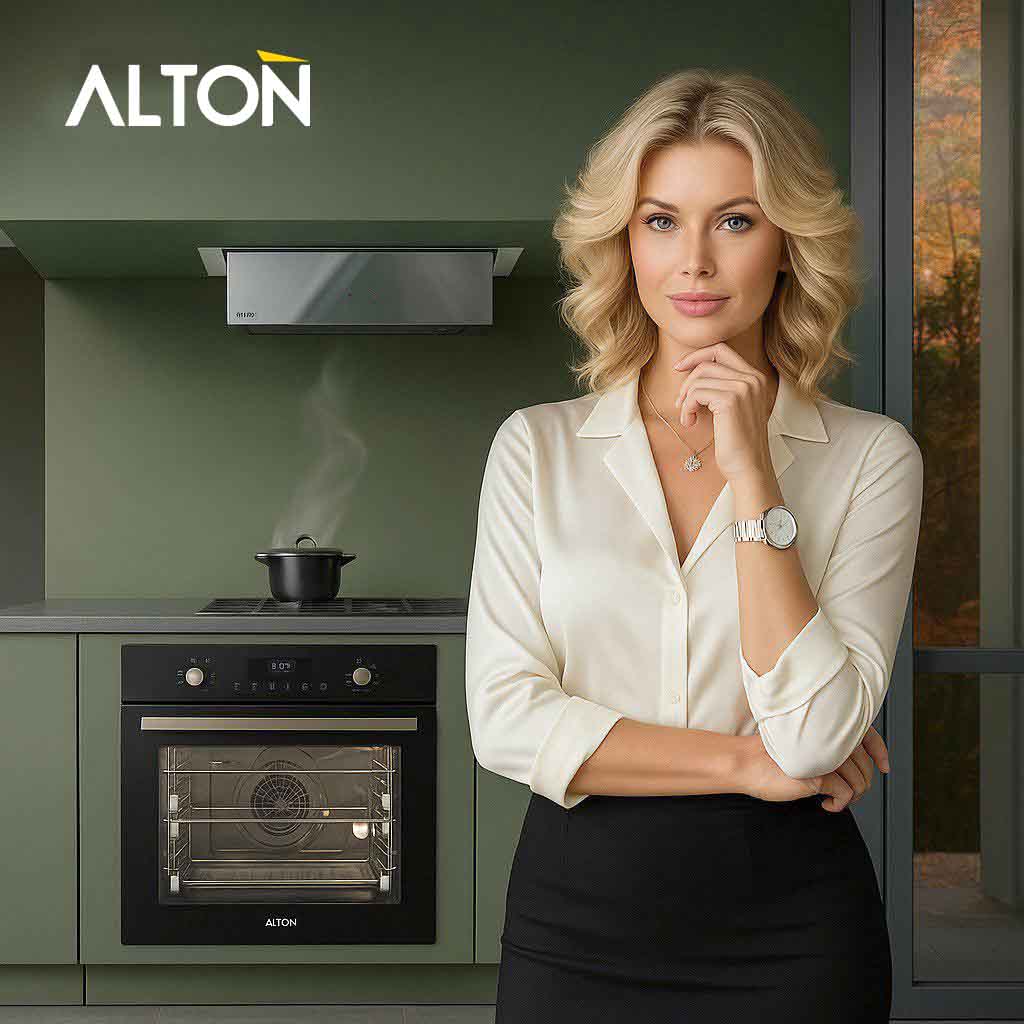
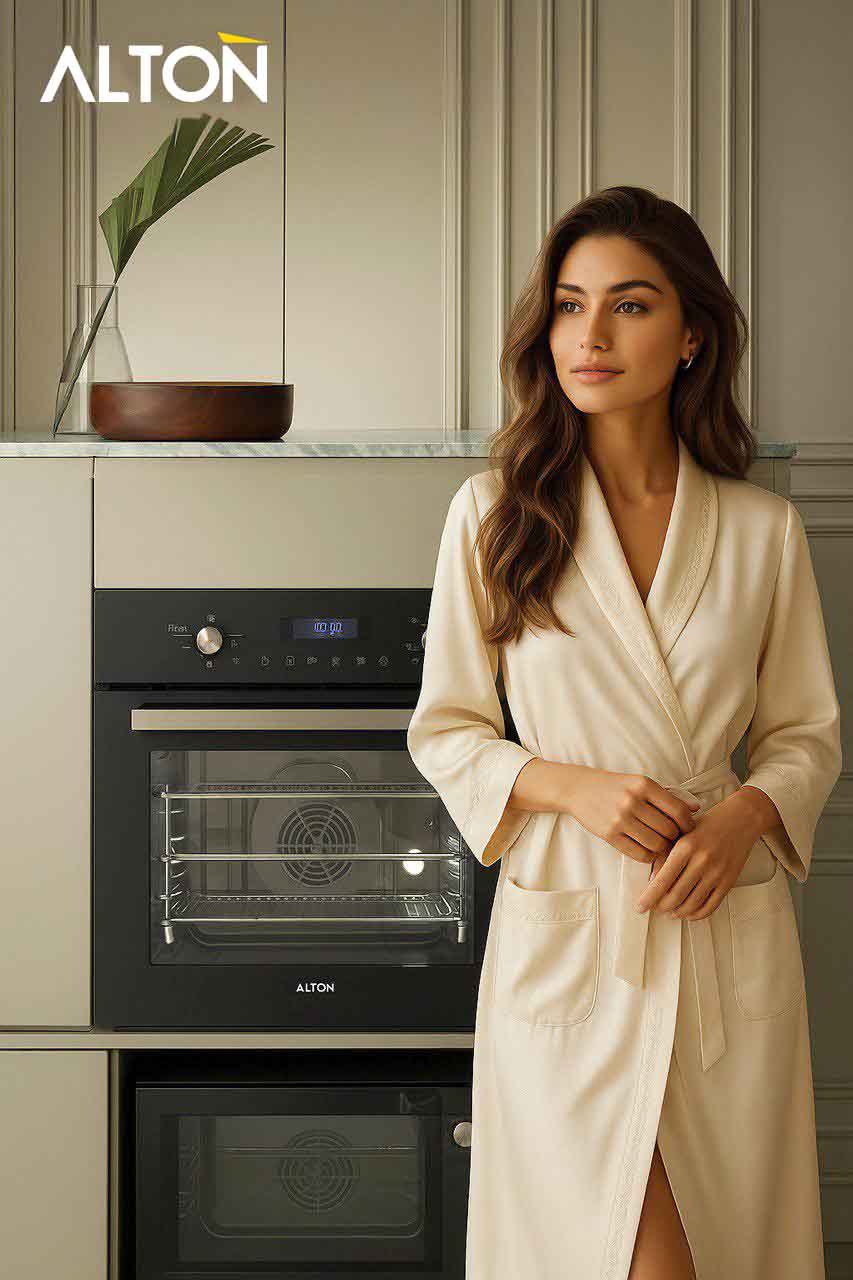
5. Photography Style
- Calm and honest
- Real environments
- Warm, natural light
- No heavy filters or over-processing
6. Brand Promise
“Engineered reliability — created for real life.”
Never exaggerated. Always grounded.
Tone of Voice
How ALTON speaks:
Clear. Calm. Assured. Helpful. Human.
We avoid hype.
We speak from experience.
We never shout.
Language example
Instead of: “Revolutionary cutting-edge technology!”
We say: “Tested. Trusted. Built to perform — every day.”
Tone should feel mature, confident, supportive, real.